Updates and art as I advance through Sheridan College's animation program.
Thursday, December 15, 2011
Sunday, December 11, 2011
Storyboard Painting
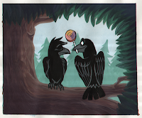
Had to take a scene from our storyboard and paint the layout. We could put the characters in if we wanted to. I did since a tree branch is a little unexciting haha.
Saturday, December 10, 2011
Caricatures
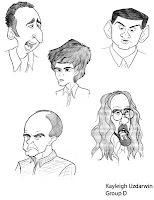
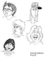
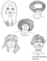

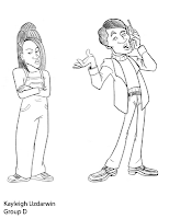
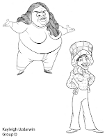
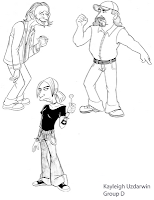
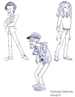
For character design class, we had to draw caricatures from video and/or real life. I drew some from random newscasts, That 70s Show, Maury, Jerry Springer (always interesting characters on those shows lol!), Doctor Who, and some other Youtube videos I found.
Sunday, December 4, 2011
"Perfect Gift" Layout Workbook.
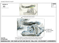
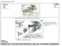
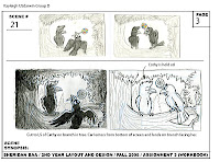
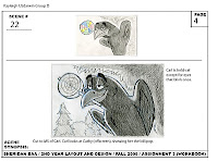
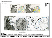
In layout we had to take 5 scenes from our storyboard and add more detail to the layout along with lighting.
"Perfect Gift" Storyboard
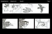
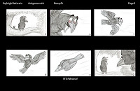
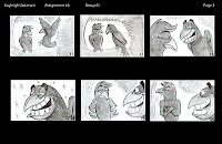
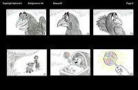
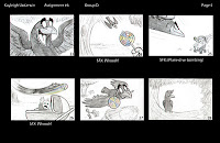
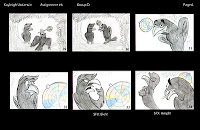
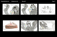
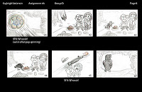
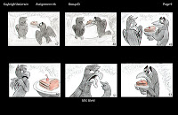
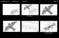
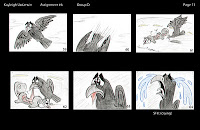
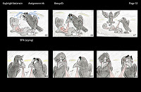
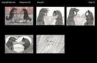 This will be turned into a Leica Reel with music and some sound effects. This is an original story I came up with, based on a theme my class chose, "the perfect gift." I dunno why crows, roadkill, and guts came to my mind when I thought of that theme, though.
Monday, November 28, 2011
Male and Female Character Expressions
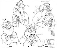
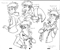
We had to make up two characters, one female and one male, and base them on caricatures of people we did so they'd have a unique face and not just a generic looking one. We had to do the expressions provided to us by our teacher.
I love Peter Emslie's class. He's really talented and draws awesome caricatures, and his classes have really got me into drawing people again and getting better at human characters. And his classes are always fun!
I like how my girl turned out more, despite me having trouble with her at first.
The blue-line pencil is still on the originals, I just removed it in Photoshop.
Monday, November 21, 2011
Walk/Run/Interaction
Original Video - More videos at TinyPic
Sorry it's small and blurry :/ The original looks better but uploading always makes it small for some reason.
Monday, November 14, 2011
Interior Layout Painting
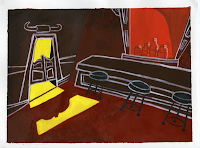
My failed attempt at copying the UPA animation style (Cartoon Modern) from the 1950s/1960s haha. I like it, 'cept for the white lineart, I have a hard time holding a brush super steady so it's kinda sloppy in some areas. Once again, scanner didn't do the colors justice. The texture and shading didn't show up in the scan for some reason.
Sunday, November 13, 2011
Saturday, November 5, 2011
Smilodon
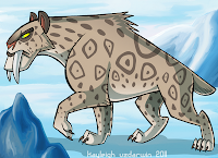 Just some personal artwork. Extinct animals were so awesome :B
I tried a more graphic style and liked how it turned out.
Thursday, November 3, 2011
Contrasting Characters
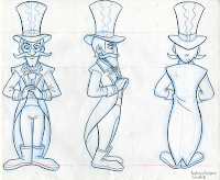
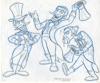
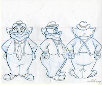
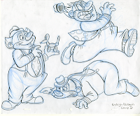
I like my ringmaster but don't like how my clown turnaround came out.
It's hard to get front views looking completely symmetrical and if one little thing is off, the whole thing looks wrong.
Tuesday, October 25, 2011
Weight, Lift, Toss Animation
Original Video - More videos at TinyPic
Thursday, October 13, 2011
Serval
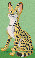
Just personal artwork. I used the studio's Cintiqs to draw and color this. Well, I sketched it on paper first. I want a Cintiq now, it's so much easier than a regular tablet. Too bad they're expensive :/
But I felt like drawing a Serval, they're my favorite animals (:
Poem Storyboard
Poem:
The Spangled Pandemonium
Is missing from the zoo.
He bent the bars the barest bit,
And slithered glibly through.
He crawled across the moated wall.
He climbed the mango tree,
And when his keeper scrambled up,
He nipped him on the knee.
To all of you a warning
Not to wander after dark,
To all of you a warning
Not to wander after dark,
Or if you must make very sure
You stay out of the park.
Is missing from the zoo,
And since he nipped his keeper
And since he nipped his keeper
He would just as soon nip you!
Character Design:
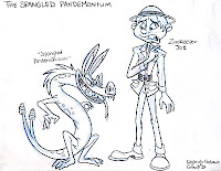
Original Beat Board:
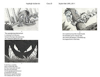
I followed the poem closely and didn't come up with anything really creative at first.
Final Storyboard:
I really had fun with this. This storyboard was pinned up on the wall and another classmate had to be able to follow the story and pitch it, called a reverse pitch. If the classmate had trouble "reading it", then many things would have to be fixed for the final. The person who read mine had no problem following the story, and everyone got a laugh that I put cameos of me and my two friends drawing animals at the zoo, which made me happy haha. She even knew it was us (: My professor told me to edit a few things, like panels two and three should be angled to match panel four (I did that in Photoshop), and to add in panel twenty to show my other friend and I running off away from the creature, leaving my other friend behind to get eaten. "Don't worry Alex it's just a cartoon," my professor said.
Sunday, October 9, 2011
Exterior Layout/Painting
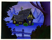
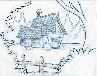
I'm so mad, the scanner messed up the colors. The bushes in the foreground are more blue-green but scanned more black-ish. I tried adjusting the color in Photoshop but it didn't work. Gah. Well, what can you do?
Subscribe to:
Comments (Atom)


