Monday, November 28, 2011

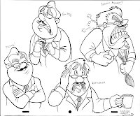
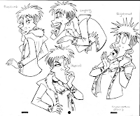
Male and Female Character Expressions


We had to make up two characters, one female and one male, and base them on caricatures of people we did so they'd have a unique face and not just a generic looking one. We had to do the expressions provided to us by our teacher.

I love Peter Emslie's class. He's really talented and draws awesome caricatures, and his classes have really got me into drawing people again and getting better at human characters. And his classes are always fun!


I like how my girl turned out more, despite me having trouble with her at first.
The blue-line pencil is still on the originals, I just removed it in Photoshop.


Monday, November 21, 2011

Walk/Run/Interaction


Original Video - More videos at TinyPic

Sorry it's small and blurry :/ The original looks better but uploading always makes it small for some reason.

Monday, November 14, 2011

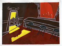
Interior Layout Painting


My failed attempt at copying the UPA animation style (Cartoon Modern) from the 1950s/1960s haha. I like it, 'cept for the white lineart, I have a hard time holding a brush super steady so it's kinda sloppy in some areas. Once again, scanner didn't do the colors justice. The texture and shading didn't show up in the scan for some reason.


Sunday, November 13, 2011

Royal Winter Fair Drawings


We didn't have to do as many drawings as last year so we got to have a little more fun at the fair.


Saturday, November 5, 2011

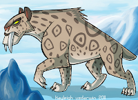
Smilodon

Just some personal artwork. Extinct animals were so awesome :B
I tried a more graphic style and liked how it turned out.

Thursday, November 3, 2011

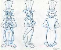
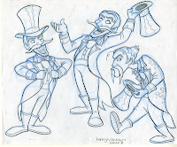
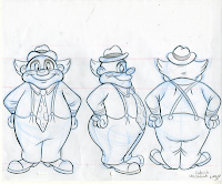
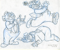
Contrasting Characters


I like my ringmaster but don't like how my clown turnaround came out.

It's hard to get front views looking completely symmetrical and if one little thing is off, the whole thing looks wrong.