Sunday, December 12, 2010

Layout Portfolio


For Komza's class, we had to do 5 of these. I chose to do scenes of some characters I've had for a few years now, been developing them more and more. And you get to see my strange obsession with the 1920s/1930s Prohibition Era xD I have a few mobster characters, but my main characters are part of a jazz band. Todd is the trumpet player, Krystal is the singer, Vinny is the sax player (I did the character expressions assignment with him), and I have many more not shown here, including a bassist, drummer, trombonist, and piano player. Since I'm learning so much at school, I feel a lot more confident in their story, design, and all that jazz (no pun intended there)


This is Todd, he's pretty much the main protagonist in my story. He "sold" himself to a mobster and speakeasy owner named Johnny Toobad (brownie points if you know where I got the name from) to play his trumpet at the club as an attempt to further his career. He then meets Krystal's band and they bring him into their band when they're in need of a new trumpet player. When Todd can't pay up to Johnny, he winds up getting the whole band in trouble. I guess this scene he has a feeling someone is following him...
I just noticed the perspective on the house in the background is messed up errr. /will fix later

I decided that this is my favorite drawing of the five.
Some unnamed characters at a speakeasy. This scene became unintentionally funny, because it looks like the bartender is tired of pouring shots for this dog, and his friend is starting to get mad at him for drinking so much hahaha.

Todd again. Maybe he's trying to serenade some lovely lady next door? Who knows.

Vivian is Todd's ex and this is her on and off British boyfriend Wellington, whom she plays for a sap (and uses his money, even though she's quite wealthy herself). Yeah Vivian is quite the little biotch. They're in front of the doors of the Cotton Club, which was a jazz club in Harlem during the Prohibition Era. It was hard finding a good ref with a clear shot of the doors, since the pictures were mostly blurry black and white photographs, so I tried my best to get it as accurate as I could.

Vinny and Krystal in another speakeasy scene. They're taking a little break from playing music, and it seems like something Vinny said sparked anger in Krystal. Or maybe she just had one sip too many lol. They're in love with each other, they just don't know it haha. Their bartender and friend (who I decided to name Phil) is trying to intervene, but they're not paying attention to him. Try not to pay attention to my failed attempt at Art Deco lol.

Friday, December 10, 2010

Other Layouts

Different views from that first RV layout I did. Forgot to upload them x3
I only like these two of the four I did. So yeah.

Tuesday, December 7, 2010

Animatic (Animated Storyboard)

WHAT IS THIS RIDICULOUSNESS.
Well uh. Hmmm. Well in storyboard class we watched Oliver Twist and Star Wars Episode Five clips and our teacher freezed frames and we had like 15 seconds to draw them.
So in digital tools class we could use either our Oliver Twist one or Star Wars, and make an animatic (animated storyboard) with it, and add our own twist to it using the same layouts. I chose the Star Wars one.
So here's the clip of Star Wars (watch from 2:00 up until 4:00) so you have an idea what I'll be doing in my animatic xD
Star Wars Clip

And here's my ridiculous version. The drawings aren't fantastic, but we had a limited time to do this and all xD OH AND IT HAS SOUND. SO TURN UP THAT VOLUME OF YOURS.

This is actually kinda inspired by when we used to take camping trips in New Hampshire at this state park, and would sneak into No Swimming areas of the lake and jump off a large rock and into the water. Whenever the Ranger would drive by, we would all duck under the water and hide xD

Wednesday, December 1, 2010

Artist Master Copy

Ugh painting is my weakness. Especially gouache...tough medium :/
We had to copy a painting or a layout from any animated movie. I bought this awesome book called Art of Princess and the Frog (loved the movie) and it had a ton of beautiful concept layouts for the film so I chose one of them.
I guess it came out better than I thought it would...and definitely better than my previous paintings. Let's hope Maureen thinks it's ok, she's a tough critic xD
Princess and the Frog (c) Disney
Update: Got a 55/60 on it. Maureen liked that I took on such a difficult piece and did a pretty good job on it. The problems were that the darks shoulda been darker and the lights shoulda been lighter. Mostly the highlights on the roof and the dark areas of the shack. They kinda dried like that :/ But I didn't want to go back and mess it up the day it was due xD Oh well, still a very good grade considering how little I've painted throughout my life.

Monday, November 29, 2010

Character Expressions

Another assignment for Character Design (my fav class in case ya didn't notice!) I had fun with this one. I've had this character for a good long time and I figured he'd be good for this project. Squishy fat faces are the best to give expressions to haha.

Thursday, November 18, 2010

Royal Winter Fair Life Drawing Portfolio

For life drawing our whole class took a trip to the Royal Winter Fair in Toronto. A few friends and I got together and hopped onto the Go Train and it took around 30 minutes to get there. In New England where I come from we have something similar called the Big E, but the Big E doesn't have as many animals and has more fair attractions as well as being outdoors. The Royal Winter Fair was huge and I've never seen so many farm animals haha. People from all over the world come to show their animals, and I saw the biggest horses I've ever seen. Apparently they were draft horses. But man, they were monsters! It was really fun, I had an awesome Buffalo burger and bought a cool dragon belt buckle (I collect them xD) And the picture in my title page is a true story. I was trying to draw this llama, and all of a sudden a bunch of kids come running over and start banging on the cage, where my sketchbook was leaning on. Not only that, but they screamed "LLAMA! LLAMA! LLAMA! HEY LLAMA!"....for 5 minutes straight. Or more. It got wicked irritating. Pro-tip: Parents, do not let your kid's scream in a llama's face. Shut them up. They shouldn't behave like that in public, I don't care how excited they are! xD


S & C Curve Animation Assignments

The S and C curve is called that because, well, it's made up of S's and C's! xD
We had to do a marine animal and a book page turn, and we were given the choice to clean up one or the other, so I cleaned up my Eel animation, and the book page turn is  slightly sketchy. We also had to do exposure sheets (dope sheets) for our cleaned animation, which contains directions for the camera movement such as pans, and repeated frames, and other directions for the camera person. The Eel consisted of 18 frames in the cycle and my background was 3 sheets of animation paper and I scanned it in and put it all together for a panned background.


Friday, October 29, 2010

Character Posing

Bahhh I went through a bunch of trouble with Photoshop putting this together. I guess scanning six 600 dpi files was too much for the RAM to handle and they wouldn't save! I thought I was gonna have to start all over, scanning each in and adjusting the levels/contrast to make the line art look decent. But all I had to do was adjust Photoshop's memory intake to 100% whereas it was at 50% before. *phew* So here's some character I came up with for Character Design class, we had to do 6 different poses. I guess he's some sorta alligator, on the hunt for the biggest, juiciest catfish in the bayou? Lol.


Thursday, October 21, 2010

Hands and Feet Life Drawing Portfolio

For Life Drawing we had to draw 12 hands and 12 feet xD And make a title page and present it in a folder. (Thanks for sending those up, ma and pa!) xD


Feet and Hands tend to be the devil for a lot of artists, including me. But I think I've improved a lot with them and I'm very proud of my hands xD My feet...meh, they're alright. I hate drawing feet. And we also could do something cartoony for the title page 9w9;; The scanner didn't really do them justice...and some came out darker than others blah.
And hooray for harmonicas 8D

Tuesday, October 19, 2010

Portfolio?

Well my dad is sending me up my portfolio that got me in (forgot to bring it with me!) and I'll be posting some of that in a week.


IN OTHER NEWS. 12 hands and 12 feet is due Friday, almost done! Will post that soon too C:

Who's excited for Book Page Turn?! Wooooo.
Marine animal sounds more fun xD I'm either gonna do a shark or an eel. Not entirely sure yet.
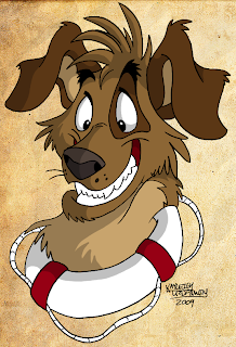
Monday, October 4, 2010

Character Layout

Here's to all those good years RVing with my folks. Sadly we sold our trailer this year :C Probably so I could go to this school LOL! But someday I'll get my own RV and my parents when they retire probably will too and we can do it all over again =] So here's a picture of a retired RVing couple! xD

This took me like...3-4 hours LOL. I'm pretty proud of it, only 5 weeks in and I've already been getting better at drawing xD I think I could of done a better job on the camper in the background, I dunno it just seems...awkward to me? Maybe because everything is in perspective and it's not? xD Possibly.
Well I hope Komza likes it x.x

Thursday, September 30, 2010

Title Page thingy

For Digital Tools class. I'm into the whole Mobster thing...I dunno they're fun to draw xD So are ugly, matty wolves xD It was hand-drawn but completely inked and colored in Photoshop.

Character Rotation


I'm pretty proud of how this came out...'cept I made the shoulders on both of the 3/4 back views a little lower than they should be...but oh well. This character doesn't actually have a name, but my classmates called him "Smokey on a Bad Day" so I went with that xD

He animated pretty well too C:

Friday, September 24, 2010

Toronto Zoo

Today I'm going to the Toronto Zoo for the first time to draw some animals, so I'll make sure to upload those when I'm done c: I heard it's a huge zoo! :D

Some Old Art

Here is some older art I grabbed off my old dA (which I'm in the process of deleting since I don't go on anymore.)